It all started on Facebook where I noticed a post by I fucking love science. This isn’t strange, it happens a lot; down the rabbit hole I go. This time I came out on the other side staring Wolfram Alpha data visualization right in the face.
How small is Australia?
For starters, here’s a short list of the things I know about Australia:
- Kangaroos and koalas
- The great barrier reef
- Sydney, Melbourne, Brisbane, Perth, and Adelaide
- Big land mass somewhere in the south pacific
- Beer, when translated to Australian, is “Fosters”
- Kangaroos
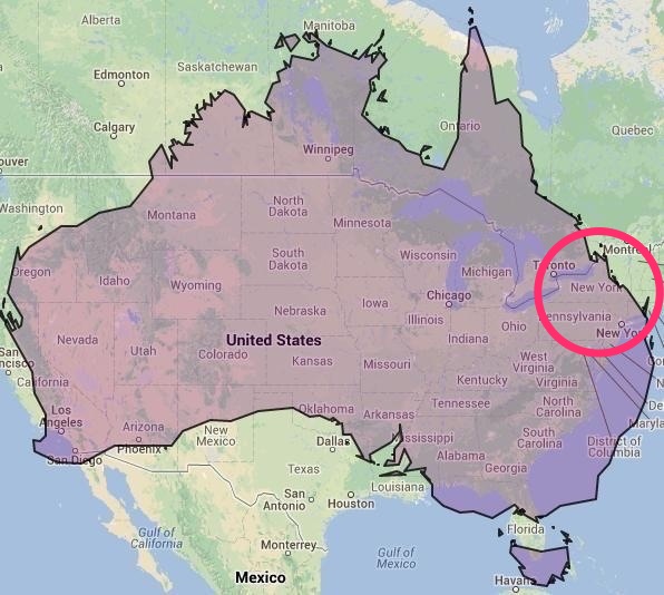
You get the picture. So when IFLScience posted an article with an image of a World map scaled by population size the quotes that really stood out to me were:
“Where in the world did Australia go?”
and
“North Korea has a larger population than Australia, with 25.1 million people compared to 23.7 million, respectively.”
Obviously if my knowledge of Australia is so limited then surely my knowledge of North Korea is even less, but I know enough to know there’s a pretty striking size difference. Of course I quickly moved into a space that I’m more familiar with started comparing to combinations of US states, starting with NY. So I broke out my google fu for some facts and visualizations.
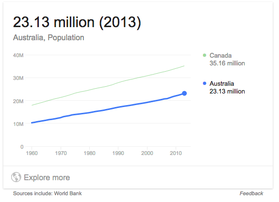
I started by asking Google to tell me how many people there were in Australia. Which it did nicely with a little graph. I guess Google knew I was surprised by the smallish number of people there since it thought I might want to compare the total to the number of people living in Canada over the last 60 years. Interestingly, both are growing, but Canada is growing faster.
The next bit of info I needed was the population of NY. So I asked Google again, and this time I got data on a comparison of the population of New York with the total people in California over the last 100 years. It may not shock too many people to know that there’s a huge gap in the growth of these two states, but the numbers are still surprising. Since 1915 NY is just a little over two times larger while California is 13 times larger going from 3 million people to just about 39 million. But I digress.
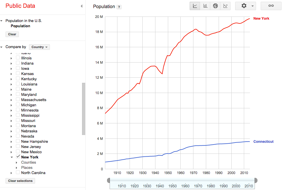
I was more interested in finding a geographically small state connected to NY that would make up the small difference, a gap of about 4 million. I clicked the little “Explore More” button and was given a nice little interface that allowed me to replace California with Connecticut. This probably should have been the end of it but of course it wasn’t.
Wolfram Alpha – Living in the future
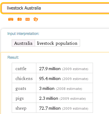
I wasn’t satisfied with the visualization for my question. I tried a number of combinations but Google had been as helpful as it planned to be. Enter Wolfram Alpha, a computational knowledge engine, known to many as wealth of crazy information. I gave it a relatively clear query of exactly what I wanted to see “compare populations of australia, new york state plus connecticut” and BOOM.
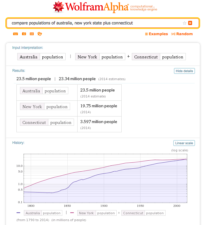
I got exactly what I was looking for. All the way back to 1790. As of 2014 Connecticut + New York has almost exactly the same number of people as Australia.
All in all I’m not sure how useful that information is, but it does give me a much better mental picture using data that I’m much more familiar with. I got to learn some fun things and take some advantage of some services that turn out to be pretty fun. And if that’s not good enough for you, there’s more. Wolfram Alpha has a little related searches link below the results ;).
*This was my first post using nothing but markdown in a text editor, so that’s fun.
for more profundity or pithy humor follow me on twitter – @bicb
Comments