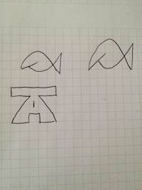
I’ve finally gotten around to messing around with an original logo for the blog. Just in time to be told that I really need a new theme. Apparently there’s too much whitespace or something. Anyway… It’s been something that’s been on my mind for a while. Obviously there’s been a bit of radio silence since my birthday reflection post so I thought this would be a fun little project to sort of get my motivation going.
I started by just drawing a few of the ideas I’ve had in my head on a whiteboard to see what I could come up with. This led to a couple of the better ideas going into an actual notebook. I had another sheet with a few more variations but ultimately I ended up with just these two versions to digitize.
I never claimed to be a good artist. That holds true for the digital versions too.
First I tried making the fish logo. Neither the graphic or the drawing turned out as well as what I had on the white board but it was worth giving it a try just to see how it would turn out.
It wasn’t what I’d hoped so I just moved on. The T and A logo obviously was supposed to go along with the Tangential Arguments name. So obviously the rounded A was at a tangent to the horizontal line of the T. See what I did there? Pretty clever, huh? Yep, that’s how you can tell I’m not a creative type.
Once I got it into it’s final version in the circle I stopped seeing the original design. Now I can’t see anything but the outline of a road approaching the horizon from a first person view. In the end I feel like that might be the most fitting description of the content here anyway. So a happy mistake it was, and I’m going to keep it. At least until I’m convinced I need a new layout.
for more profundity or pithy humor follow me on twitter – @bicb


Comments